March 28th, 1979. Three Mile Island Nuclear Generating System in Pennsylvania, United States.
During one of the operational cycles, the system attempts to close the valve. The signal is sent. The light on the control panel indicating the valve status turns off. But the valve gets suddenly stuck. Coolant escapes the nuclear reactor, leading it to overheat and radioactive gas release.

Because the light reporting about the valve’s status was malfunctioning, the plant operator figured out the issue when almost half of the uranium had already melted. The release of radioactive krypton-85 and xenon-135 made 140,000 people within a 20-mile zone surrounding the plant evacuate. All because of this small design error.
Being design experts in software development, we tend to focus on improvements: how to make the design more emotional, how to improve conversions through better visual language, how to optimize user experience so people would want to get back to the app. For instance, in the case with Zutobi, we made a lot of design decisions helping people get engaged in the learning process and stay motivated up until their DMV test.
But when we recalled the story with the nuclear plant in the design department of our mobile application development services company, we decided to research what other consequences UI/UX mistakes can cause.
After some research, we present the most expensive UI and UX mistakes that have been made in modern history.
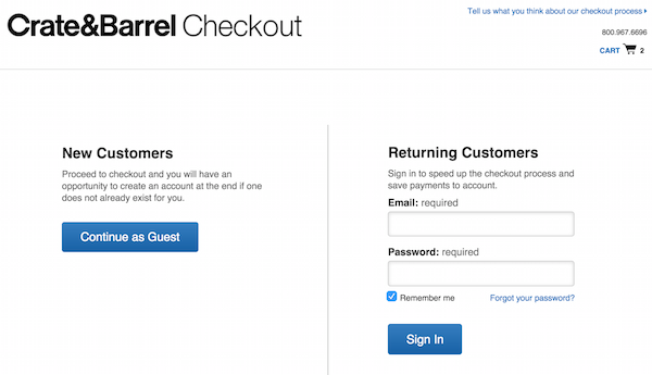
1. User Registration Worth $300M
In 2009 Jared M. Spool revealed a case when a simple UX mistake made the major e-commerce site lose $300 million of revenue.
The mistake was simple: after users filled the shopping cart and proceeded to checkout, they were offered to sign up (or sign in) on the site. But it turned out people couldn't recall if they registered on the site before and which email and password they use.
When the designers allowed people to continue the checkout without an account, the number of purchasing customers grew by 45%. The company generated an extra $15 million of revenue in the first month. Over the year, the site brought an additional $300 million of revenue.

Now, letting users check out as guests is a general best practice utilized at most ecommerce sites.
By the way, we found even a more prominent number: the whole e-commerce industry lost ~$1.42 trillion due to bad UX in 2016-2020.
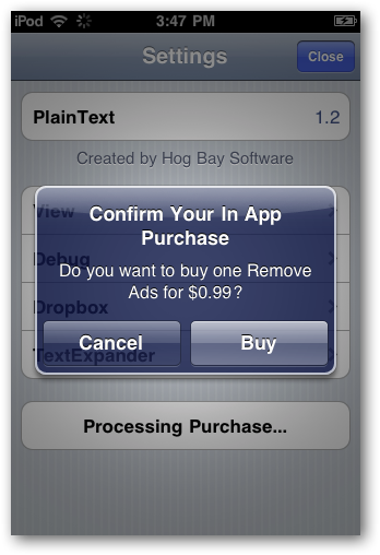
2. $51 Million For Too Simple In-App Purchases
At the dawn of free games, kids could make in-app purchases with parents knowing nothing about it. Sometimes children would spend up to hundreds of dollars before these transactions would be noticed.

The problem was present with Amazon, Apple, and Google stores. Amazon claimed they made enough disclosures, but this argument didn't work out in the court.
What they all needed to do is just another layer of user authorization before making the in-app purchase. The cost of this UX mistake? Google refunded $19 million; Apple refunded $32.5 million. And Amazon brought the issue to the court; as of January 2021, it was still unknown what the final settlement sum may be.
3. Checkbox That Caused Shipwreck
In 2017, a poorly designed checkbox caused the John S McCain destroyer crew to lose control of their ship and collide with a Liberian tanker. The destroyer was wrecked, with ten sailors deceased due to drowning.

You can notice the checkbox on the image above. This interface allows adjusting the speed of the propellers controlled by different motors. By setting them to run at different rates, you can steer the ship in a way supplementing the rudder. But since the rudder on the bridge is a more convenient steering tool, this checkbox remains checked at most times.
The author of the investigation, Adrian Hanft, suggests it was unchecked accidentally, which caused confusion on the bridge. Even if we assume the crew knew this checkbox’s function, they couldn't immediately figure out why they lost control of the ship steering. And so, within four minutes, they performed actions that made the situation only worse.

As a custom web design company, we immediately see many ways to fix this issue: sliders uniting into one when the checkbox is checked, a warning when unchecked, using a button instead of a checkbox. Unfortunately, there was nobody to propose these suggestions before the shipwreck.
In the end, repairs of the ship were estimated to $223 million.
4. $1.85 Billion Loss Due To The Wrong Question

In 2009, Walmart had a one-question survey asking its customers: "Would you like Walmart to be less cluttered?"
Naturally, everyone answered "yes.” Less clutter is always better than more clutter.
In response, Walmart removed 15% of its inventory. The result? $1.85 billion loss in sales that led Walmart to fire the team behind this decision.
But if only they changed that closed (yes/no) question to an open one, like "What do you think should be changed in Walmart?" things would be so different by now. Instead, they just ignored customers' needs, even though their intentions were quite the opposite.
Today, open questions are a golden standard of user interviews in every design team.
By the way, in 2015, Walmart changed its strategy and increased sales by “simply” raising wages to its employees. Luckily, our design and development company’s clients have financially motivated teams on board and look for more technological ways to increase their profit.
The Store
Check for more


5. The Invisibility That Led To a 50% Drop in User Engagement
Icons8 is a company known for drawing icons, and in 2014 they added a Request Icon feature. It looked like this:

According to the feature logic, the icon request must be upvoted a certain amount of times so that Icon8 would make them.
After three years of growth, the company redesigned this section and specifically the vote button, so that it became visible only on mouseover:

Of course, this is probably not the only reason why the new design didn't work, but the most prominent one. What you can't see, you can't use: the average number of votes for every icon dropped from 30 to 15-16.
6. Poor Design That Allowed a $900M Transaction
The cases above might sound too outdated. So we wondered: after having two decades of all kinds of poor design, can a person still lose millions of dollars in 2021 due to a poor design?
Well, yes. And it happened with Citibank, one of the biggest and most sophisticated financial institutions worldwide. In August, 2020, three of their employees made a transaction to a creditor of their clients’. Yet instead of sending $7.8M, they sent the whopping $900M.

You might say it’s a human mistake, but it was also the software that let it happen. It made the warning about the transaction, but it didn’t contain its amount. And even though three employees reviewed the transfer screen before approval, they didn’t notice anything wrong.
Naturally, Citibank demanded the recipient to return the money, but they disagreed. The conflict moved to the court. In February 2021, a federal judge ruled the recipients are not obliged to return those $900M, though Citibank intends to appeal.
7. Even A Wrong Color Can Worth Too Much
The stories above prove the point that UX/UI mistakes can cost a lot. But we also want to supplement them with the next “one-liners,” showing that even a change as small as changing the element’s color might be worth... not just millions, but something even more valuable – a human life.
- Redesigning a hardly noticeable Buy button and adding more of them throughout the mobile site increased annual revenue by $500 million (the case of GFK)
- Changing the color of the links at Bing to a bolder blue generated approximately $80 million more in revenue from advertising
- Three nurses with ten years of experience were unable to notice that their patient going through a powerful chemo treatment therapy required rehydration because the software they were using was too complicated. The indication wasn’t noticeable enough. In three days, the patient deceased.
And What About Mobile and Web Apps?
Building software for a military ship is indeed a responsible task.
But so are the projects in the fintech, healthcare, and automotive industries that we specialize in. And working on projects like Uberdoc we realize the software we write can save or ruin someone’s life – based on how well it’s done.
However, in 2021, the competition among mobile and web apps is so dense and fierce every UX and product designer has learned the basic best practices to take care of the users’ health, finances, and privacy long ago.
So today’s product is not just about being errorless or good enough, but rather about being distinctive in its errorlessness, being advanced in its care about the user, and innovative in its problem-solving approaches.
If we’d try to outline the most common mistakes in the UI/UX, they would relate to such bad practices as using unreadable fonts, videos that autoplay, hidden/difficult navigation, rich media that make the site loading slow, etc.
Sometimes companies turn to those practices as they don’t have any better alternative, as in the case of feature-bloated Facebook.

Sometimes going for bad practices is the result of poor design expertise.

In any case, businesses do not practice measuring their losses because of going with bad design. So we’ll probably never know what these mistakes are worth. But that doesn’t stop us from learning the practices that proved their effectiveness, as well as trends introduced by avant-garde designers.
Bottom Line
Most cases on UX/UI on the Internet reveal only the big deals.
You might have heard about Avon failing to implement the new CRM system for four years and thus losing $125 million. It appeared to be so complicated sales managers were quitting the company.
So when we’re talking about the change as major as redesign, it is often easier to blame the wrongness of the direction taken.
Back in 2010, Facebook and Twitter were gaining popularity. So Digg, a popular social bookmarking site, decided to redesign and shift to a social networking niche. Afterward, it saw a userbase drop so significant that the company was sold for $0.5 million in 2012, four years after it was valued at $160 million. People didn’t want to have another Facebook.
Marks & Spenser invested £150 million into their website redesign. The main goal was to make it more magazine-style and adjust it for tablets. Shifting the focus from e-commerce to entertainment (and some technical glitches) led to an 8.1% loss in sales and £200 million in money.
Although proper research can help avoid such situations, being one of the design and prototype companies, we believe a complete design overhaul is a venture so risky you can compare it to a gambler's game. Usually, it's much better to improve the existing design systems iteratively. And the established feedback loop helps find the changes that didn't work out and the ROI of designers’ work.
This approach is also known as evolutionary design. With it, knowing other industry players' mistakes like listed above comes in handy, especially if you want to start with addressing the bottlenecks of your design system.
Speaking of a light start, check out our plans. Designed specially for first-time clients, they help get the most value for your venture from only a few weeks of working with us, and at the same time evaluate our approaches to building outstanding software.
EGO Creative Innovations. Best performance through true transparency.


