Digital businesses and online stores need quick and reliable ways to improve their effectiveness, and following essential best practices is a good way to start.
As an outsource web design company, EGO Creative Innovations has been present on the market for over 15 years. During this time, we’ve collected a wealth of best practices on website usability and design.
Following our clients’ requests, we decided to share them publicly. To get an extensive PDF list consisting of 130 best UX practices covering 25 various aspects of websites, feel free to get in contact with us.
Or you can take a sneak peek at it by checking out 30+ most straightforward of these practices in the blog post below. Please note they don’t include practices for online stores that are present in the PDF document.
Top priority
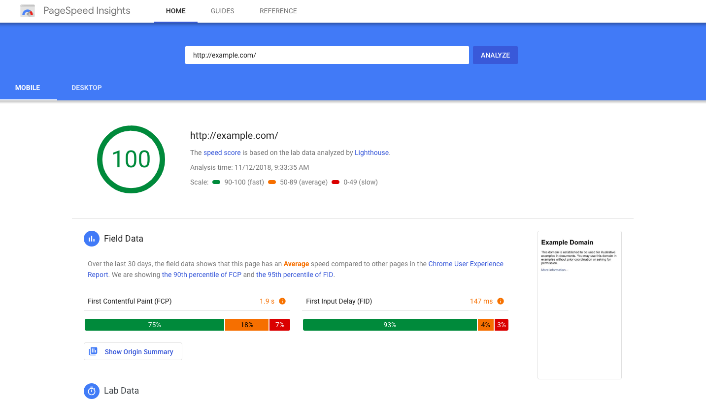
- Downloading speed. Your website or app is downloaded within 1-2 seconds. If it takes more than 3 seconds to download it, then 40+% of your users leave before the loading is complete.
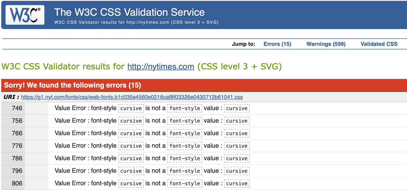
- CSS and HTML code validation. Your code does not contain mistakes easily found by web crawlers.
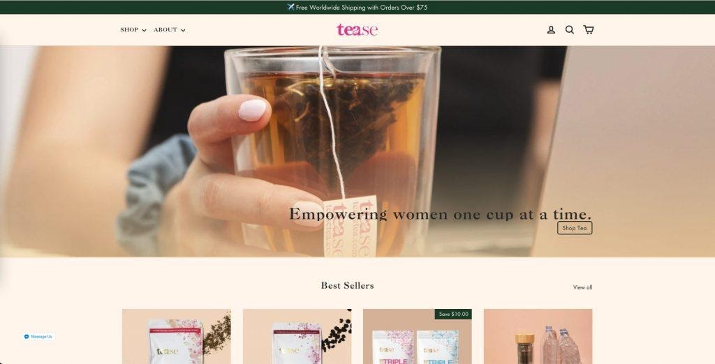
- Predictable positioning of key elements. All the expected elements of your site/app are in their usual places: the company logo is in the upper left corner, the contacts are in the upper right corner, and so on.

Design and element placing
- Block positioning. Blocks are placed on the first screen in a way that lets users think there's something interesting down below as well and make them scroll the screen.
- No element pile-up. Elements and their blocks alternate with empty space so that there is no pile-up and motley.
The cursor and clickable elements
- Cursor icon adjustment. When hovering the cursor on clickable elements the arrow icon changes to the hand icon. If the element is unclickable, no change is done. If the element can be edited by the user, the cursor turns into the editing icon.
- An explanation for non-active buttons. When hovering on the non-active button or link a short explanation appears explaining why it's non-active.
Buttons
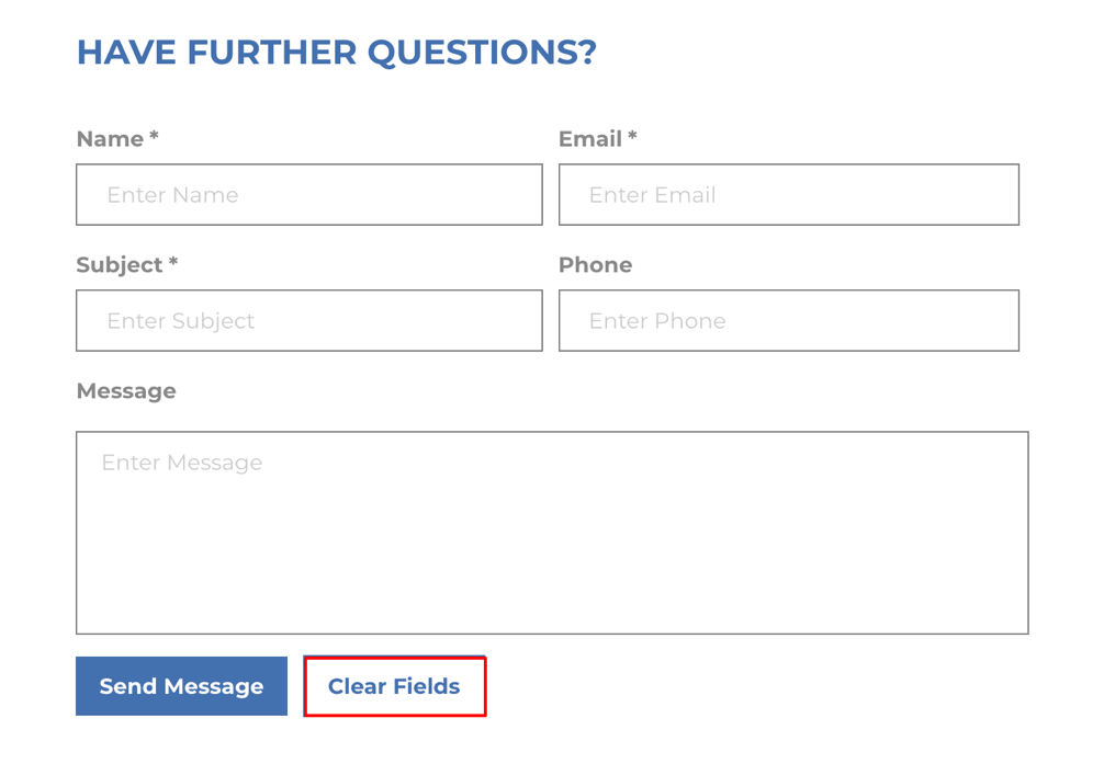
- Buttons for form cleaning. Buttons reverting last actions or removing the entered data are far enough from the Send or Confirm buttons and look different so that the user could not mistakenly click them.
Links
- Interaction standardization. All links are designed in one style. The cursor changes its appearance when hovered over the link, and the latter changes its color after it is clicked.

Communication with clients
- One-click order.

- Contacts in one place on every page. As an application design company, we regularly notice how UX consistency creates long-standing habits among users.
Feedback form
- Saving the entered text. The entered text is not lost if the user entered the wrong captcha or accidentally closed the page.
- Big texts. The form should allow the user to leave a massive message. When entering long texts, the form allows the user to quickly look at the entered text, for instance, via the side scroll bar.
The Store
Check for moreContacts page
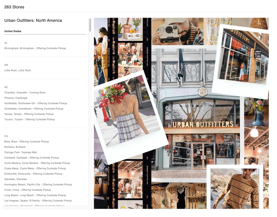
- A separate place or page for contacts of each office. If you have a few offices, show information about each of it separately. Avoid making long lists of addresses on a single page.
- Office selection from the list and on the map.
Online chat
- Real communication impression. When talking in chat, the user sees the real photo and the name of the company representative. The scripts of the bot are thought-through, avoid out-of-the-point answers and bring a positive impression about the communication.
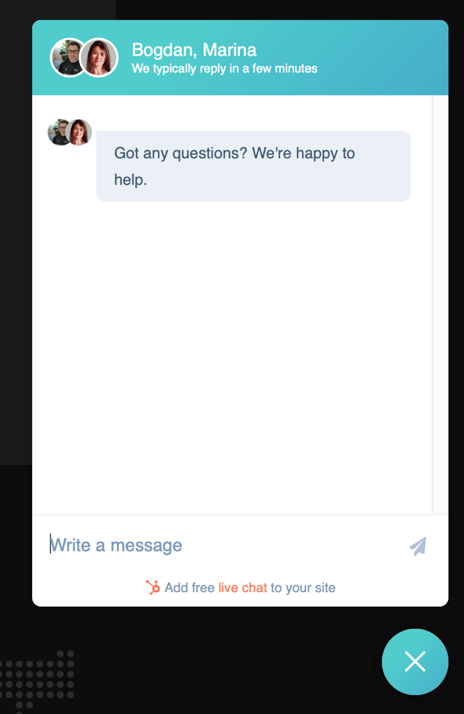
- Response time notification. The chat window informs the user on how long they should wait for the answer.
Navigation
- A clear and relevant H1. On every page, there is a heading that fits its contents.
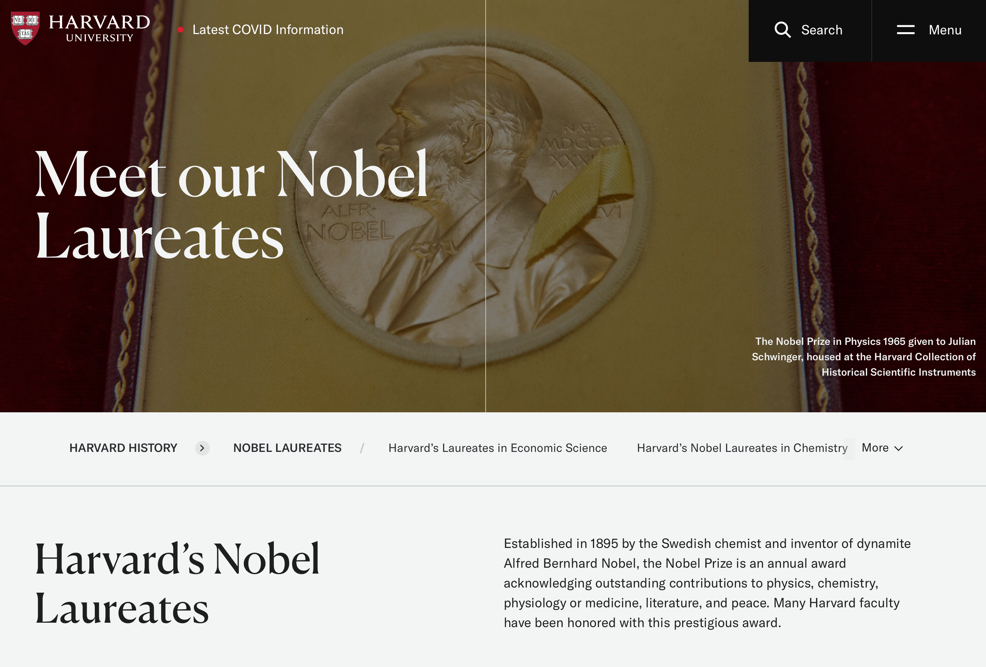
- Clickable breadcrumbs. With them, the user is able to quickly figure out the subsection they're in and get to the higher-level sections with a single click.
Main menu
- A Crosscutting main menu. Sections of contacts, delivery and payment, catalog of products and services, and other main sections are found in the main menu of the site. It takes a couple of seconds for a visitor to find the necessary information on the site.

- Item highlight. The currently selected item is highlighted, inactive, and does not reload the page when clicked.
Search
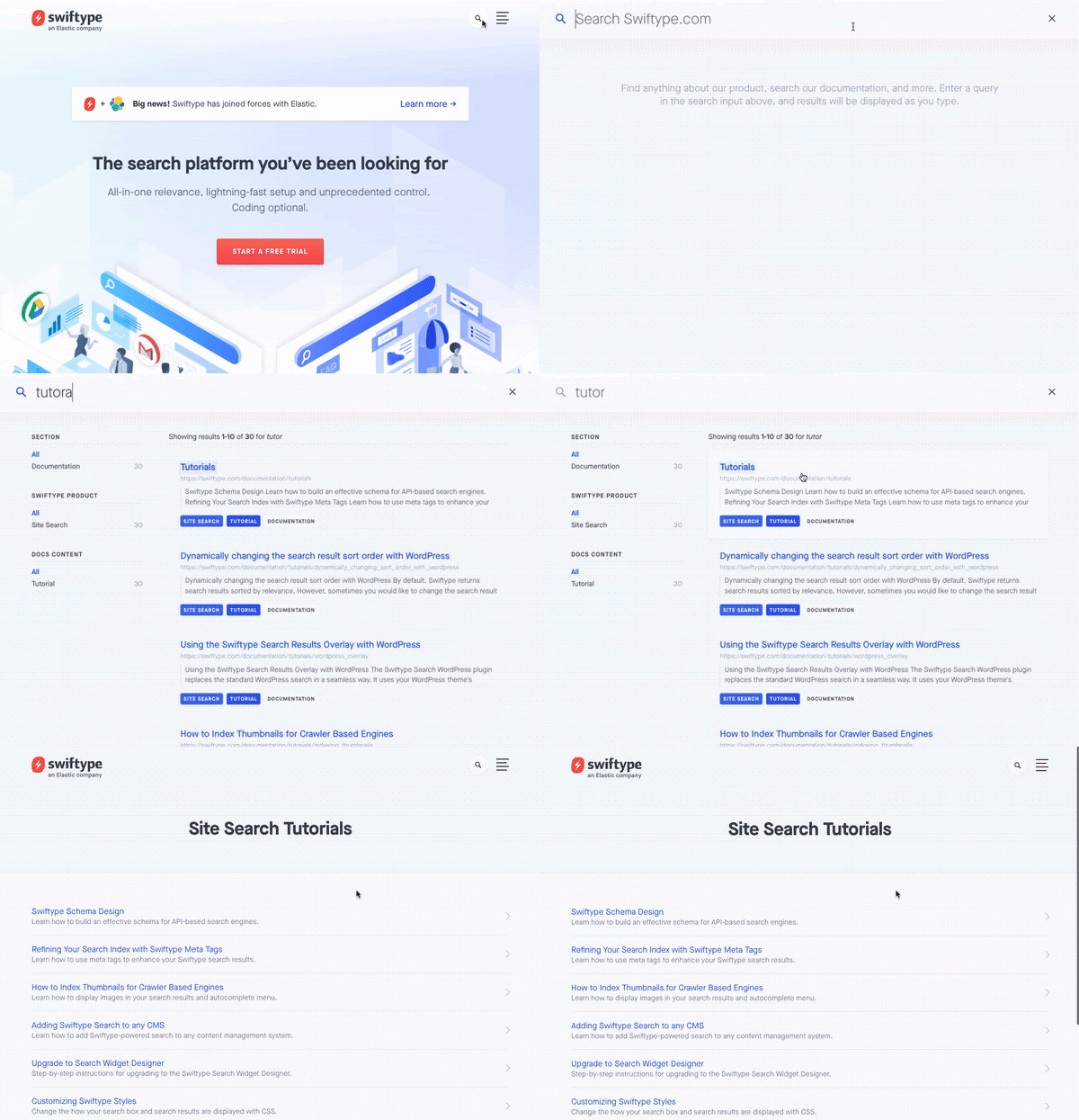
- Intuitive layout. The search field is located where the user is used to seeing it on such sites. Usually, it is in the top left or top center part of the page.
- "Live" search. As the user’s typing in a query in the search field, a relevant list of results is displayed below it. The list changes as they type. If, when the user enters a query, the live search no longer finds suitable options, the list is not cleared. Instead, the last matched values are shown.
Font
- Uniformity. Use one font family and avoid experimenting with lots of styles.
- Color standardization. Font color and background color are combined, font and background are mutually matched for comfortable perception and reading. Optimally, it’s a dark font on a light background. Link coloring is not used for normal text.
Form fillup
- Required field minimum. When registering and placing an order, the number of required fields is minimal. Usually, it is the name and email/phone number. Each additional required field is provided with an explanation of why it’s needed. If there are many fields in the registration form, they are visually combined into groups, and the groups have titles.

- Help with entering the phone:
- the field comes with intuitive prompts
- a user can use a dropdown list to select a country and a region code
- an alternative option is offered for users with non-standard numbers
Signup procedure
- Ease of registration. In addition to the standard registration, the user is offered to sign up via social networks.
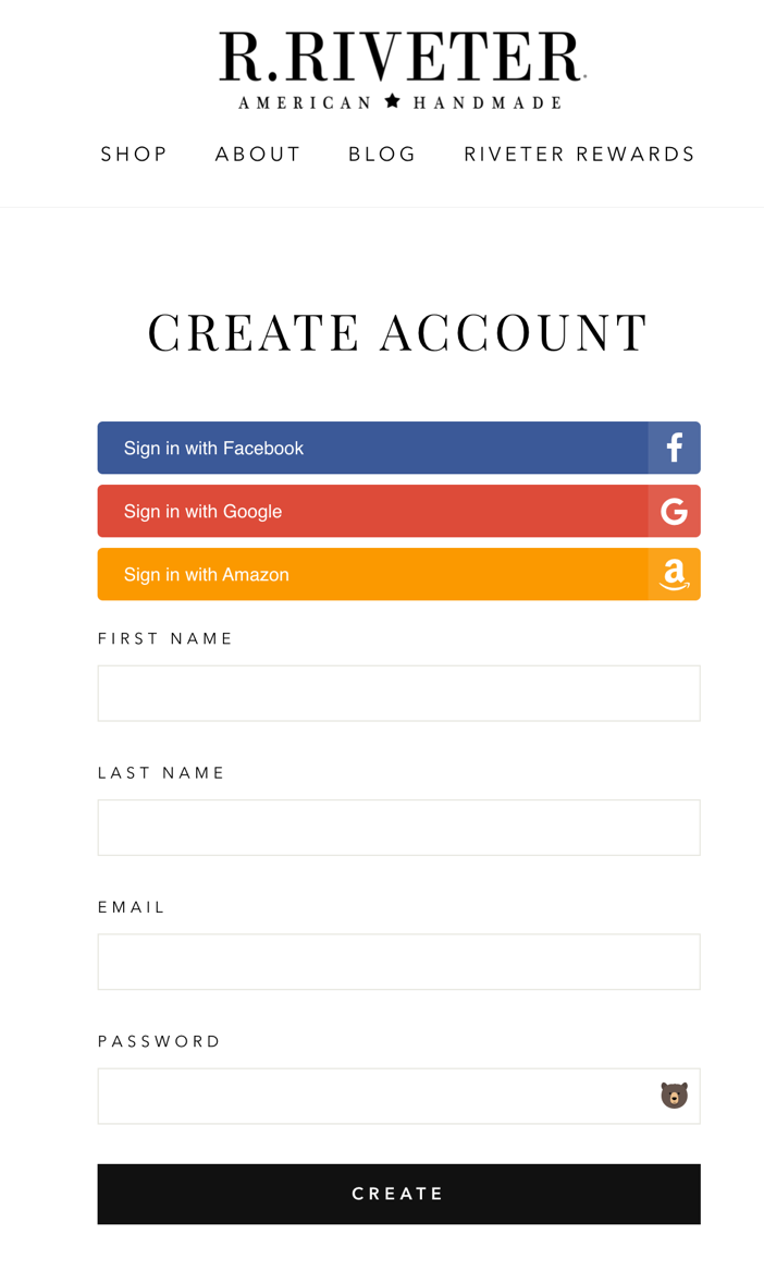
- Ability to unsubscribe from the mailing list. When registering, the user has the opportunity to unsubscribe from receiving the newsletters by unchecking the corresponding checkbox. Even better if they are offered to tick the appropriate checkbox to subscribe to the newsletter.
Checkout
- Standard ordering algorithm. When ordering:
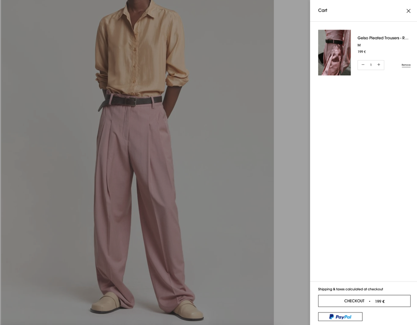
- the user receives a pop-up message about adding an item to the cart
- the user sees the animation of sending the goods to the cart (which helps the user notice where the cart is)
- the cart icon visually changes to show the number of items in it and their total cost.
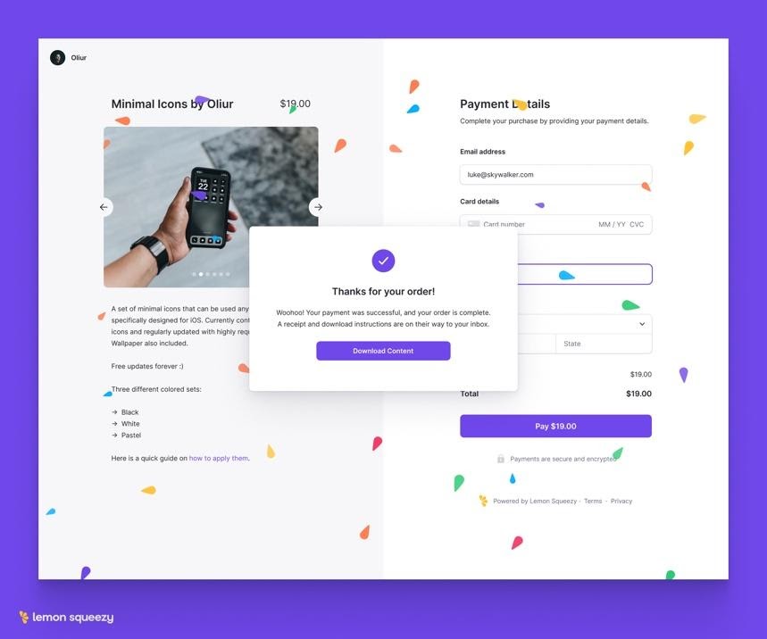
- Order confirmation. After completing the order, the user:
- sees the thank you page and the explanation of further actions
- the user selects the channel through which they want to receive notifications on the order and its status.
Payment
- Confidentiality. The client is clearly informed that the personal data they enter during the payment process is safe (icons of the security technologies and explanations are helpful here).
- Proof of payment. If the payment was successful, the user sees a corresponding message and a link to return to the site.
Bottom line
Over time, this list will inevitably change. People change their habits, new technologies better usability solutions. Still, the quality of your product is majorly defined by how well it fits today’s trends.
As a UI design agency, we see how 3D elements, gradients, animations, minimalistic icons, and pastel colors regularly help sites and apps stand out among slower competitors and win awards. Combined with top usability, it will make your users stay with you for a long time. So, investing effort in it is worth the cause.
And if you’re having troubles facelifting your site proceed to get a free consultation.


.webp)


